Why accessibility on a phone is different
Mobile casino apps shrink a game room to a palm‑sized screen, where design choices hit harder: tiny tap targets, banners crowd actions, and prompts hurry you, straining seeing and grasp.
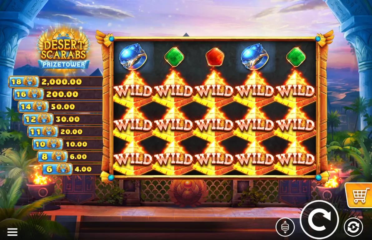
Consider a quick example: a slot interface places the bet control next to a glowing “spin” button. On a bus, one bump and a thumb lands on the wrong spot. A design that separates critical controls and confirms big changes helps anyone, not just people with motor or vision limits.
Common design traps that block access
Several recurring patterns silently raise the barrier to comfortable, informed play. They do not look “broken,” yet they steer attention away from what matters: the rules, the cost of each action, and the choice to pause. Below are pitfalls and their typical impact.
Hidden friction points
| Design choice | Why it matters | Everyday example |
|---|---|---|
| Low contrast text | Reduces legibility, especially outdoors | Grey rules text on a dark table felt in sunlight |
| Tiny tap targets | Increases accidental actions | Close icon overlaps with deposit banner |
| Auto-advancing carousels | Moves content before reading finishes | Bonus terms slide away mid-sentence |
| Keyboard traps | Prevents tabbing through elements | Cannot reach “withdraw” link with a keyboard |
Visual contrast, motion, and touch accuracy
Clear text and steady screens cut errors. Strong contrast aids bright light and low vision. Make motion optional. Big, well-spaced touch targets suit real fingers on the go.
Design choices that help right away
- Use strong contrast for all text and icons, not just headlines.
- Offer a “reduce motion” toggle that pauses autoplay, confetti, and carousels.
- Make key buttons large, with clear gaps between “bet,” “spin,” and “buy.”
- Ensure visible focus rings for keyboard and switch users.
Example: a blackjack app that adds a thick outline when a button is focused and widens “hit” and “stand” to thumb size lowers slip‑ups for everyone, including people using a bluetooth keyboard or a switch device.
Navigation clarity and cognitive load
Mobile layouts often hide menus behind icons, stack banners above the game, and split settings across several drawers. Each extra click adds cognitive load: the mental effort to remember where things live and what they do. Clear labels and consistent placement keep that load light, which is essential when choices involve real money.
Reduce confusion step by step
- Prefer “Deposit,” “Withdraw,” and “Limits” over ambiguous icons.
- Reach help, limits, and transaction history in one or two taps.
- Ask before changing stake or buying features; show what changed.
- Display current stake, balance, and time spent in the main view.
Example: a clear header that always shows balance and a footer with three stable tabs—Games, Wallet, Help—outperforms a shifting grid of icons. Users do not hunt for basics; they glance, then act.
Practical checks before you play on mobile
Before you play, do a quick accessibility check to spot issues. Increase text size and contrast; if content vanishes or overlaps, it’s not adapting. Pause motion; if ignored, expect distraction.
You can also open a neutral directory page just to observe how promotions are typically presented, for instance ninecasinobonuses.com. The point is to see how layouts and labels vary so you recognize when terms are easy to find and read, and when they are buried under moving banners.
Quick checklist you can apply in a minute:
- Can you read rules and paytables outdoors without squinting?
- Are primary controls large and well separated?
- Can you pause autoplay, animations, and sounds?
- Are help, limits, and history one or two taps away?
- Is there an easy way to undo or confirm sensitive actions?
Conclusion: An accessible mobile casino is not about fancy features; it is about readable text, calm motion, predictable paths, and forgiving controls. Small design choices add up to comfort and fewer errors. A quick personal check before you play helps you notice hidden risks and choose a design that treats your attention with care.